Week 41, as we revisit the 10-year anniversary of the book Slow Flowers
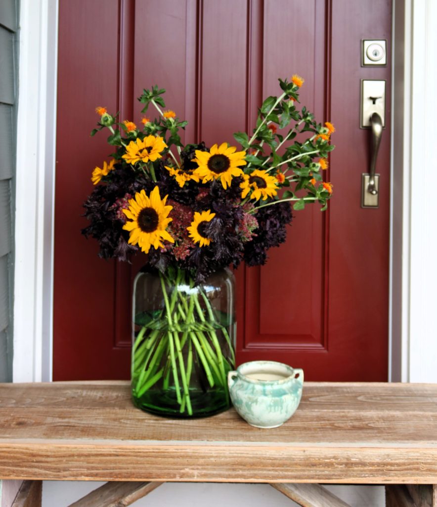
Large enough to be used as a terrarium, this bottle green jar is one of two I purchased years ago from a Seattle antique shop at the urging of designer friend Jean Zaputil. The size and shape, not to mention the irregular hand-blown rim, appealed to me as objects now displayed on the living room mantel.
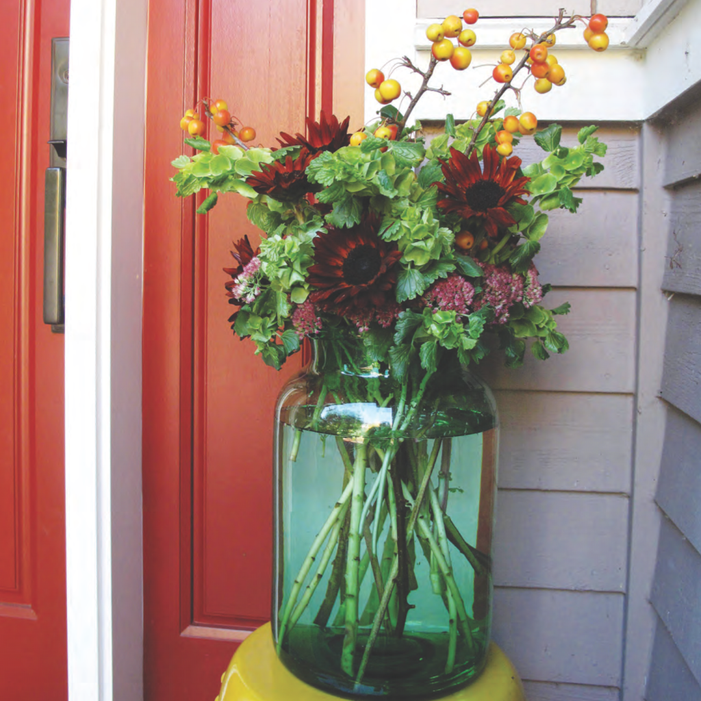
Back in the fall of 2012, when I was photographing arrangements for the 2013 publication of Slow Flowers, I knew I wanted to use the smaller of the two jars as a floral vase, seen above. That one measures 13-inches x 9 inches with a 5-1/2 inch opening. I used Sedum ‘Autumn Joy’, Bells of Ireland, chocolate sunflowers, and fruiting crab apple branches. I photographed the composition in front of the dark rust door of our former home.
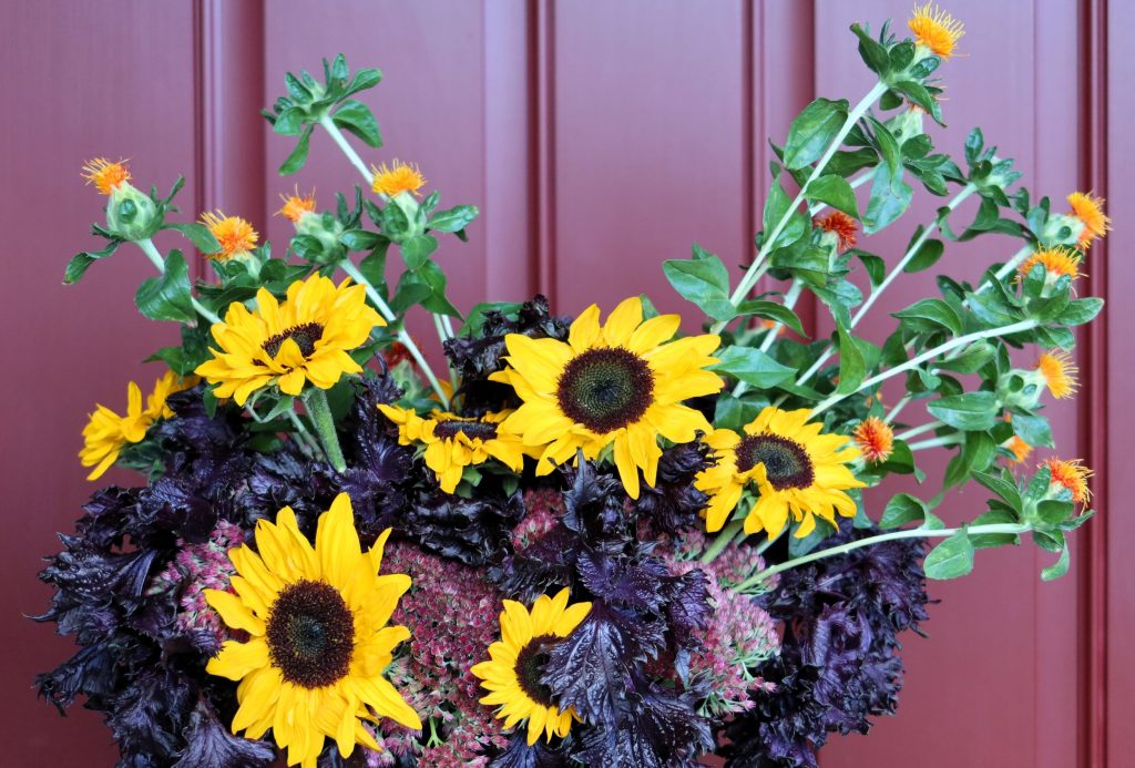
This week, in revisiting and reinterpreting the seasonal arrangement in a vintage jar, I again chose the smaller one and sought botanicals with the longest stems possible. I shopped the Seattle Wholesale Growers Market and selected these ingredients from the market floor:
Sedum ‘Autumn Joy’, grown by Space Lotus Floral Collective
Shiso Foliage (red-burgundy), grown by Diamond Day Bouquet
Brilliant yellow sunflowers with dark centers, grown by Field to Heart
Safflower stems, BC-grown
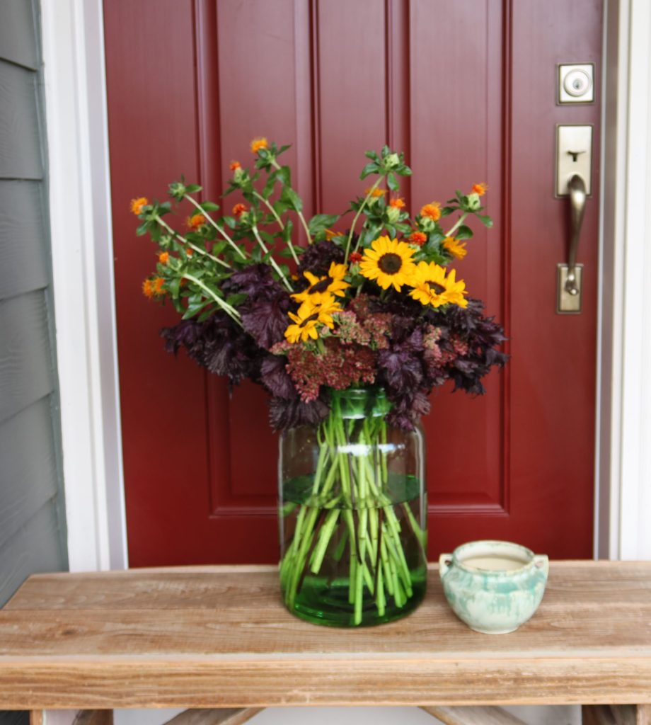
As with the earlier arrangement, the Sedum served as a bit of a “green mechanic” to support stems of other flowers. I wasn’t able to source bells of Ireland this time around, but I’m so thrilled that I found the red-burgundy Shiso, its foliage glossy and frilly. It is the connecting element that seems to blend beautifully with everything else. And while it was just a few weeks too late for fruiting crabapple branches, the safflower with such intense orange-gold blooms was a delightful new accent for the design.
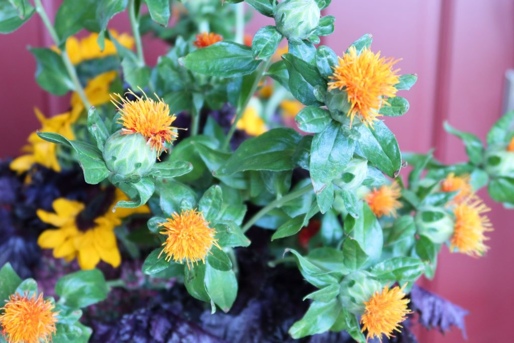
Speaking of Safflower, here is a great cultural tip sheet on the annual from Johnny’s Selected Seeds. Why aren’t more of us growing this beautiful annual that serves as a flower, a “filler” or textural element,” and dries with ease?
The photograph’s backdrop is surprisingly similar. In our new home, the exact door as the prior one is painted a dark burgundy-red — a great contrast to the vivid yellows and darker elements.
